Reporting
User Guide
Create Reports : Report Types : Chart with Dynamic Series
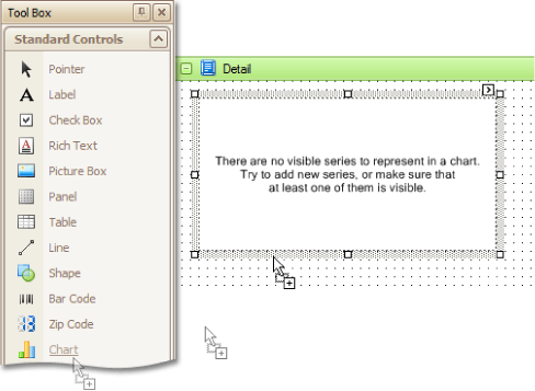
To create a report with a Chart control bound to data, in which the all series will be auto-created using the series template specifying common data binding properties for all series, proceed as follows.
In this example the 'GSP' table of the sample gsp.mdb database will be used. This table contains the Gross State Product (GSP) statistics for some US regions.
|
•
|
|
Note:
|
At this point, the Chart Wizard may be displayed (if its Show wizard every time a new chart is added option is enabled). Click Cancel to close the wizard's window and manually customise the chart.
|
|
•
|
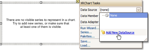
To bind the chart to a data source, click its Smart tag, and in the displayed actions list, expand the Data Source dropdown selector and click Add New DataSource. The Report Wizard is displayed.
|
The wizard will guide the user through the process of assigning a data source to the chart. For detailed instructions on the wizard's steps, refer to Bind Report to Non-Dabacon Data, as this process is similar.
|
•
|
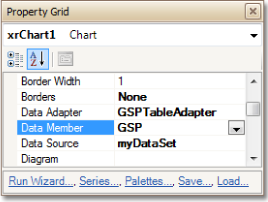
The specified data source is then assigned to the chart's Data Source property. The Data Member property is also set, which specifies which table or view of the dataset the chart should obtain data from, as is the Data Adapter property.
|
|
Note:
|
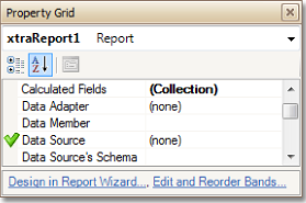
The report's Data Source property must be set to None. Otherwise, the chart will be blank when previewed.
|
|
•
|
To specify the data field which is to provide data for the series names, the Series Data Member property must be set.
|
|
•
|
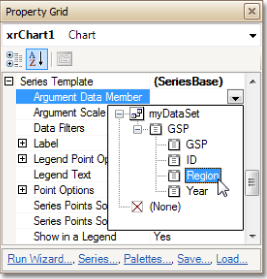
Next, set the Argument Data Member property.
|
|
•
|
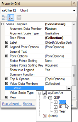
Define the of the Data Members property, specifying the data fields from which the series obtains the data values of its points.
|
By default, the name for every series automatically generated by the chart using its Series Data Member property's is obtained directly from a data field in the bound data source. However, it may be necessary to add prefixes or suffixes to these names. The user may therefore customise the Series Name Template object returned by the Series Name Template property to add some text to the beginning or to the end of the series names. For instance, set the Series Name Template.Begin Text property to GSP in.
Set the Series Template.Label.Visible property to No, to hide labels for all series points, and prevent the chart from being crowded with numerous overlapping labels.
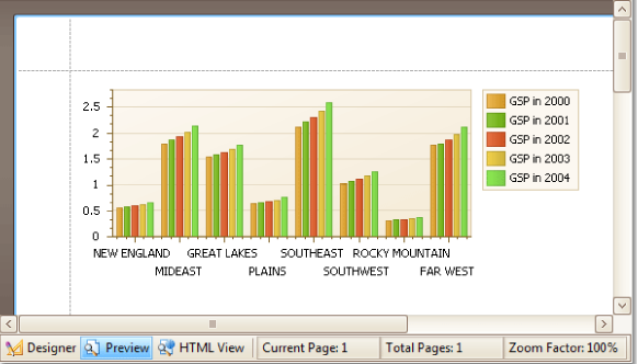
Initially, all axis labels (which in this example show the names of the US regions) are lined up and overlap. To avoid this, select the X-Axis (which is also accessed via the Chart Control.Diagram.Axis X property) and set its Label.Staggered property to Yes.
The chart is now complete. Switch to the Preview tab to view the result.


