Reporting
User Guide
Create Reports : Report Types : Chart with Static Series
This example describes how to construct a chart of products and their prices for a chosen category using the data from the Northwind database (the sample nwind.mdb database).
|
•
|
|
Note:
|
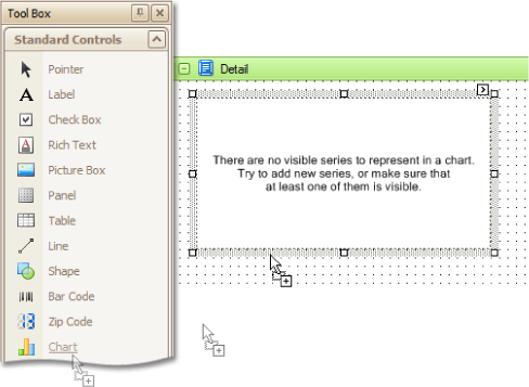
The Chart Wizard may be displayed at this point (if its 'Show wizard every time a new chart is added' option is enabled). Click Cancel to close the wizard's window and manually customise the chart.
|
|
•
|
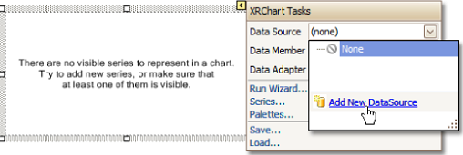
To bind the chart to a data source, click its Smart tag, and in the displayed actions list, expand the Data Source dropdown selector and click Add New DataSource. The Report Wizard is displayed.
|
The wizard guides the user through the process of assigning a data source to the chart. For detailed instructions on the wizard's steps, refer to Bind Report to Non-Dabacon Data, as this process is similar.
|
•
|
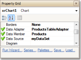
The specified data source is then assigned to the chart's Data Source property. The Data Member property is also set, which specifies which table or view of the dataset the chart should obtain data from, as is the Data Adapter property.
|
|
Note:
|
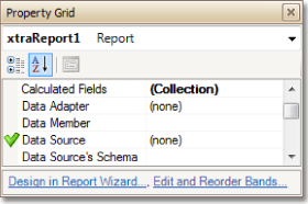
The report's Data Source property must be set to None. Otherwise, the chart will be blank when previewed.
|
|
•
|
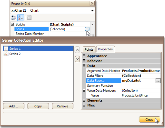
To add a series to the chart and specify its data binding properties, use the Series Collection Editor. It can be displayed either via the Property Grid, or via the Series link in the chart's Smart tag.
|
Switch to the Properties tab.
Set the series' Data Source property to the created dataset, define the Argument Data Member and Data Members properties.
|
Note:
|
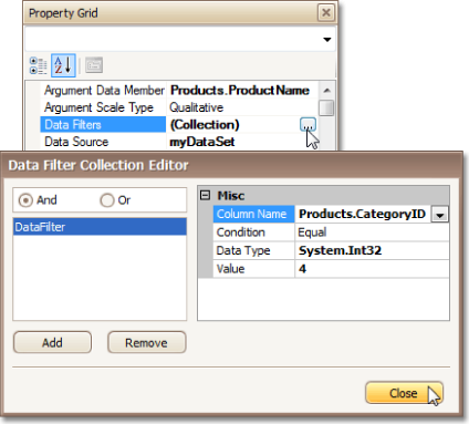
After this step, there are maybe too many data points, making the chart difficult to interpret. The chart's Data Filters property is used to limit the number of data points shown by applying a filtering criterion. Click Series1 in the chart to select it, then in the Property Grid locate the Data Filters item and click the ellipsis to display the Data Filter Collection Editor.
|
|
•
|
Click Add to add a criterion, and define its properties as shown in the following image:
|
Repeat the same actions for Series2, i.e. choose its Data Filters property, add a filter and define its Column Name.
|
•
|
Remove the chart's legend, as it shows the same data for the series, select the legend item in the chart, and in the Property Grid, set its Visible property to No.
|
|
•
|
The point labels for Series1 are unnecessary, so select the label and set its Visible property to No.
|
|
•
|
Customise the Series2 marker's appearance. Replace the default circle with the upside-down triangle by the View.Point Marker Options.Kind property and set its Size to 12.
|
|
•
|
Rotate the X-axis labels for better readability. Click the AxisX item in the chart to select it, and the adjust properties for its labels (via the Label property). In this example, setting the Angle property is 20 and the Antialiasing property set to Yes, improves the appearance of the labels.
|
The chart is now complete. Switch to the Preview tab to view the result.

